I recently came across a question posed by filmmaker Noam Kroll that resonated with something I’ve been mulling over myself: Does the cinematic look actually exist? It’s a topic filmmakers and cinematographers seem to return to often, particularly as the industry fills with evolving tools and trends. As a colorist, balancing the technical and the artistic is part of my everyday, and I often find myself drawn to this question of what actually defines cinema. The answer seems to lie in the ways we choose and craft visual elements—choices that add meaning, elevate the story, and connect scenes and colours into a cohesive, immersive world.
So, here’s my take on what makes a film feel truly cinematic. There may not be a single answer, but I think the exploration itself reveals some valuable insights.
Intent, Technique, and a Little Bit of Mystery
When DSLRs with large sensors first hit the market, they made it possible to achieve shallow depth of field and high resolution with accessible equipment. Suddenly, it seemed that anyone could achieve the “cinematic” look. But it didn’t take long for filmmakers to realise that these tools alone couldn’t deliver the full experience of cinema. As Martin Scorsese once said, “Cinema is a matter of what’s in the frame and what’s out,” which points to something essential: cinema is as much about what we show as it is about what we choose to leave out.
From a colorist’s perspective, this is where technique enters the picture but doesn’t complete it. Stephen Nakamura, the colorist behind films like Blade Runner 2049 and Se7en, has observed that creating visual impact isn’t about making each shot look perfect but about serving the story’s core. In Blade Runner 2049, for example, the neon-soaked visuals and rain-drenched cityscapes don’t just provide mood—they embody the film’s reflective, melancholic tone. When style becomes story, the visuals function as an extension of the narrative, drawing the viewer further into the film’s world. Perhaps cinema, then, is defined by how each technical choice aligns with an underlying intent, creating a visual language that immerses us fully.
Technique is Essential, But It’s Just the Starting Point
Mastering technique is fundamental, but it’s really only the beginning of true cinema. Yes, composition, lighting, and colour provide the language of visuals, but cinema only comes alive when these elements serve a purpose beyond the technical.
Consider Roma by Alfonso Cuarón. By shooting in black and white and using natural light, the film creates a world that feels both intimate and universal, inviting viewers to experience each scene as though they’re witnessing a personal memory. There’s a powerful impact in Cuarón’s approach. The visual style goes beyond aesthetics; it becomes a way to access the textures of everyday life, making each moment feel immediate and tangible. The film’s subdued, observational quality transports us fully into its time and place, allowing us to “enter” the film rather than simply watch it.
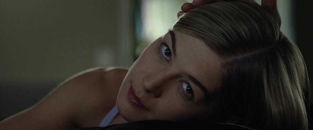
Similarly, in Gone Girl, David Fincher uses a muted, clinical palette to reflect the film’s themes of deception and mistrust. The film’s polished yet sterile look functions almost like a mask, echoing the characters’ carefully constructed lives. Here, the cool, restrained visuals become an integral part of the story’s tone. Rather than dazzling with technical perfection, Fincher’s visual choices create an atmosphere that is beautiful yet unsettling, immersing us in a story where appearances deceive. His style amplifies the story’s tension, showing us how technique, while necessary, takes on meaning when it connects us to the narrative’s deeper layers.
Colour: The Subtle Art of Emotional Intent
Colour is, without a doubt, one of the most powerful tools in cinema. It has a unique ability to deepen the emotional resonance of a story, allowing the viewer to feel the weight of each moment without needing words.
Moonlight is a brilliant example of how colour can serve as an emotional undercurrent. Barry Jenkins and colorist Alex Bickel crafted a colour palette that reflects the protagonist’s journey, using warm tones to signify connection and cold hues to convey isolation. The colours aren’t merely for beauty; they provide a visual language that speaks to the protagonist’s inner life. Watching Moonlight, we feel the character’s conflicts and desires as if they’re unfolding before us, creating an emotional texture that remains with us long after the film ends. Jenkins himself noted that he wanted the colours to “give a sense of what the character feels,” a sentiment that resonates deeply with me as I strive to bring intentional meaning to each colour in a scene.
A similar approach can be found in Phantom Thread, where Paul Thomas Anderson and cinematographer Robert Elswit rely on natural light and a restrained palette to shape the story’s tension and intimacy. The restrained colours and subtle gradations leave room for the characters’ complex relationships to emerge in delicate, almost whispered ways. Here, each visual choice feels like it holds a secret, allowing the story to reveal itself slowly. This choice to work within a limited palette gives the film a haunting, quiet elegance, evoking a sense of mystery and longing that elevates the narrative without overpowering it.
Beyond the Latest Trends: Cinema as a Timeless Art
As each new wave of technology expands what’s possible, “cinematic” has become a moving target. But films with staying power often sidestep trends in favour of timeless choices that support the story.
Nomadland, directed by Chloé Zhao, embodies this kind of timeless approach. By shooting in natural light and capturing landscapes at magic hour, Zhao roots the film in a grounded realism that feels as expansive and raw as the nomads’ own journeys. Here, the choice to use natural light isn’t merely a stylistic decision; it allows the landscape to play an active role, becoming a character itself. This approach lets the film’s themes of freedom and solitude breathe, resulting in a viewing experience that feels both intensely personal and grand in scope. The authenticity of the visual choices creates an atmosphere where viewers feel they’re inhabiting the world right alongside the characters, rather than observing from a distance.
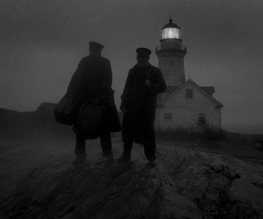
In a completely different but equally intentional choice, Robert Eggers’ The Lighthouse uses stark black-and-white cinematography and a nearly square aspect ratio to create a sense of claustrophobic isolation. Eggers’ visual approach amplifies the tension between the characters and underscores the film’s eerie tone. The black-and-white visuals and restricted framing make the viewer feel as if they’re confined alongside the characters, heightening the story’s psychological intensity. With The Lighthouse, every element is carefully chosen to immerse us in a world that is both surreal and brutal. This isn’t simply about following trends; it’s about making choices that reflect the story’s unsettling tone and draw the viewer deeper into its haunting world.

Cohesion: The Secret Ingredient
In the end, true cinema happens when all elements—story, visuals, sound, and colour—combine to create a cohesive, immersive experience. When these choices align, a film transcends the ordinary, drawing us into a world that feels complete and real.
Steven Spielberg’s Schindler’s List exemplifies this cohesion at its finest. The film’s black-and-white palette, interrupted only by a single red coat, creates a powerful, unflinching focus on the human tragedy of the Holocaust. By reducing the visual palette, Spielberg keeps us grounded in the story’s raw emotional weight. Every aspect of the film’s visual language serves the story’s purpose, stripping away distractions and allowing the viewer to feel the story’s impact in a profound way. It’s an approach that demonstrates how each choice, when carefully considered, can resonate on multiple levels, making the story linger long after the credits roll.

Why Technique Must Serve Intent
In a world where high-end tools are within reach, it’s easy to get lost in perfecting technique. But true cinema reaches beyond technical mastery, into the realm of experience and emotion. As Tarkovsky once said, “The aim of art is to plough and harrow the soul,” a sentiment that reminds us that the impact of cinema isn’t about its “look” but about the impression it leaves on us.
Technique is necessary, of course; it’s the language filmmakers use to communicate. But in the hands of a master like Akira Kurosawa, technique becomes a pathway to truth. Kurosawa knew that cinema’s power wasn’t in flawless execution but in how technique could reveal deeper meaning. With him, each choice felt deliberate, a way of bringing the viewer closer to the heart of the story.
As a colorist, my role is not only to enhance visuals but to help shape a cohesive world that feels true to the story. Each colour, every tonal shift, serves a larger purpose, connecting the visual with the emotional. When filmmakers and colorists approach each decision with purpose, we create more than a cinematic look; we create cinema—a crafted experience that resonates with the mind, heart, and soul.

